Landing pages are like the magical entry points to your marketing kingdom. They’re like the velvet ropes guiding visitors to a specific action you want them to take. Whether it’s signing up for a newsletter, grabbing a discount code, or exploring your latest product, the utilities of landing pages are multifold.
Landing pages are laser-focused, purpose-driven gems that keep distractions at bay and put the spotlight squarely on your offer. Unlike your homepage or blog posts, landing pages don’t play hard to get. They’re designed to deliver a single, clear message and prompt an immediate response.
So, as we journey deeper into the world of landing pages, remember that they’re your secret weapons for guiding users toward action. It’s not just about creating a web page; it’s about crafting an experience that sings, “You’re in the right place, and we’ve got something amazing in store for you!”
Let’s dive right in.
Here are the 10 best tips curated by experts for creating high-converting landing pages.
1. Understand the Purpose of Landing Pages
Unlike a homepage or a blog post, which can have multiple goals and distractions, landing pages keep it simple. They focus on just one thing – your call to action. Imagine you’re at a candy store, and the salesperson offers you a taste of their most irresistible treat. That’s exactly what a landing page does – it tempts visitors with a single, compelling offer.
A killer landing page has some must-have elements. First up is the headline. It’s like the catchy opening line of your favorite song. It needs to hook your visitors and make them want to read more. Then comes the subheading – it’s the supporting act that elaborates on the headline and keeps the interest going.

And let’s not forget the visuals – the images or videos that set the mood. You know, like the cool decorations at a themed party that instantly transport you to another world.
2. Conducting Target Audience Research
Suppose that you’re hosting a party, and you want everyone to have a blast. To make it happen, you need to know your guests – their tastes, interests, and what gets them excited. The same goes for your digital party, i.e., your landing page! Knowing your audience’s needs and preferences is like having the perfect playlist ready – it makes them stay and dance to your tunes.
Now, why is this target audience research so crucial?
Well, think about it. Your audience isn’t a one-size-fits-all crowd. They’re a diverse bunch with unique desires and pain points. When you know exactly what makes them tick, you can curate landing pages that align with their likings. This means higher engagement, more conversions, and happy visitors who feel like you’re talking directly to them.
3. Crafting Compelling Headlines
Imagine you’re strolling through a busy market – what’s the one thing that makes you pause? A captivating sign, right? Well, in the world of landing pages, your headline is that sign. It’s the first impression, the attention grabber, and the make-or-break factor that determines if visitors stick around.
Let’s spill the beans on creating headlines that speak directly to your audience’s soul. First off, keep it crystal clear. Your headline should be like a sneak peek of the amazing things your visitors will discover on your page. Avoid jargon or complicated phrases – simplicity is your best friend here. And speaking of friends, make it personal. Use words like “you” to make visitors feel like you’re having a one-on-one conversation.
4. Design and Visual Elements
Design isn’t just about aesthetics – it’s about creating an experience. A well-designed landing page guides visitors through a journey, making them more likely to stay, explore, and take action. It’s like laying out a red carpet for your visitors, inviting them to stay a while and discover what you have to offer.

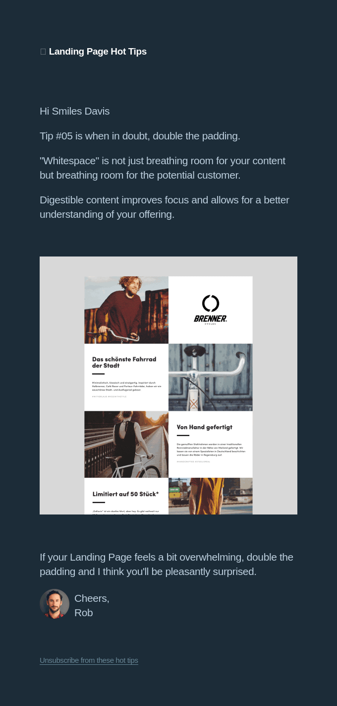
Dishing out a clean and visually appealing layout is what you need to focus on. Imagine you’re reading a messy, cluttered page – not exactly a pleasant experience, right? But a clean layout with organized sections, ample white space, and easy-to-read fonts? That’s like a breath of fresh air. Visitors can focus on the content without feeling overwhelmed.

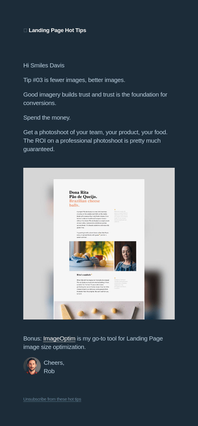
Visual elements are not just pretty decorations; they’re your storytellers. A striking image can instantly convey emotions and set the tone. A video can engage and educate in a way that words alone can’t. And graphics? They’re like visual cues, guiding visitors’ eyes to the most important parts of your page.
5. Writing Persuasive Copy
Ever wondered how words have the power to sway hearts, change minds, and guide actions? Well, that’s the magic of persuasive copy – it’s like having a conversation that gently nudges your visitors toward a desired action.
So, how do you craft copy that works its magic? First, think of benefits, not features. Visitors want to know what’s in it for them. So, instead of bombarding them with technical details, show them how your offer can solve their problems or make their lives better. Keep it concise, like a friendly chat. Long paragraphs are like monologues that can lose your audience’s interest. Short, punchy sentences? They’re the life of the party.
You see, humans are wired for stories – they’re like a secret passage into our emotions. So, weave a narrative around your offer. Talk about real people and real situations. Take your visitors on a journey that resonates with their experiences. Whether it’s a tale of how your product changed someone’s life or a journey of overcoming challenges, stories create connections that mere facts can’t.
6. Optimizing Call-to-Action (CTA)
CTAs are your digital signposts, showing the way to sign-ups, downloads, purchases, and more. They’re like the friendly guide saying, “Psst! This way to awesomeness!”
Placement and design are the dynamic duo of CTA optimization. Think about it – if you’re leading a tour, you wouldn’t point to a hidden gem and then whisper its location as an afterthought. The same applies to CTAs. They need to be prominently placed where visitors’ eyes naturally gravitate. It’s like putting the spotlight on the star of the show. And don’t forget the design – your CTA button should stand out with colors that contrast with the remaining elements of the landing page, making it impossible to miss.

7. Mobile Responsiveness and Page Speed
Mobile-friendly design isn’t just a trend; it’s a must. Think about how often you whip out your phone to browse the internet. Your visitors do the same, and they expect your landing page to be as stunning on their smartphones as it is on their laptops. A responsive design ensures that your page adjusts to different screen sizes, providing a seamless experience for all.

If your landing page doesn’t load quickly, your visitors will get weary of it and bounce away. Plus, page speed isn’t just about user experience – it’s also a big player in SEO. Search engines love fast-loading pages, rewarding them with higher rankings.
8. A/B Testing and Data Analysis
A/B testing is about experimenting with different versions of your landing page to figure out what works best. It’s like having a science experiment for your landing page. You create two versions – A and B – with slight variations in elements like headlines, colors, or CTAs. Then, you let your visitors decide which one they prefer by tracking their actions. It’s not just guesswork; it’s data-backed decision-making at its finest.
9. Building Trust and Credibility
Let’s assume that you’re meeting someone for the first time. What makes you believe they’re the real deal? It’s their actions, their reputation, and the people vouching for them. Well, the same principles apply to your landing pages – building trust is like creating a warm welcome mat for your visitors.
So, how do you earn that trust? Enter social proof, testimonials, and trust badges.
Display logos of companies you’ve worked with, mention media coverage, or showcase awards.
Testimonials are your secret weapons. They’re like personal recommendations from happy customers. Think about it – if a friend raves about a restaurant, you’re more likely to give it a shot, right?
Share real stories, preferably with names and faces, because authenticity matters. And don’t forget trust badges – they’re like certificates of authenticity that assure visitors your site is safe and trustworthy.
10. Implementing SEO Best Practices
So, what’s the secret recipe for SEO success?
First up, meta tags and URLs. Think of your meta title and description as your landing page’s introduction. Craft them with care, making sure they’re clear and compelling, and include relevant keywords. And URLs? Keep them concise and reflective of the content, like signposts pointing the way.
Then, content, which is not just the king but a kingdom. Keywords are like the secret code that connects searchers to your page. Do some research to figure out what terms your audience is searching for. Then, sprinkle those keywords naturally throughout your content, but don’t go overboard – Google knows when you’re trying too hard.
Key Takeaways
Now that you are armed with these insights, all that remains is for you to put them into action. Whether you have marketing experience or are just starting, implementing these tips can take your landing page game to the next level. But remember, optimization is an ongoing journey. Just like a skilled painter continually refines their masterpiece, you’ll want to continuously test, tweak, and refine your landing pages to ensure they are firing on all cylinders, all the time!
For any other query, feel free to contact us. We’d love to converse with you.


Ahmad Jamal - Content Writer
Latest posts by Ahmad Jamal - Content Writer (see all)
9 Ways Brands Can Leverage Social Media Marketing During Holiday Season
9 Common Technical SEO Issues that Hurt Your Website Traffic & Rankings and Their Solutions